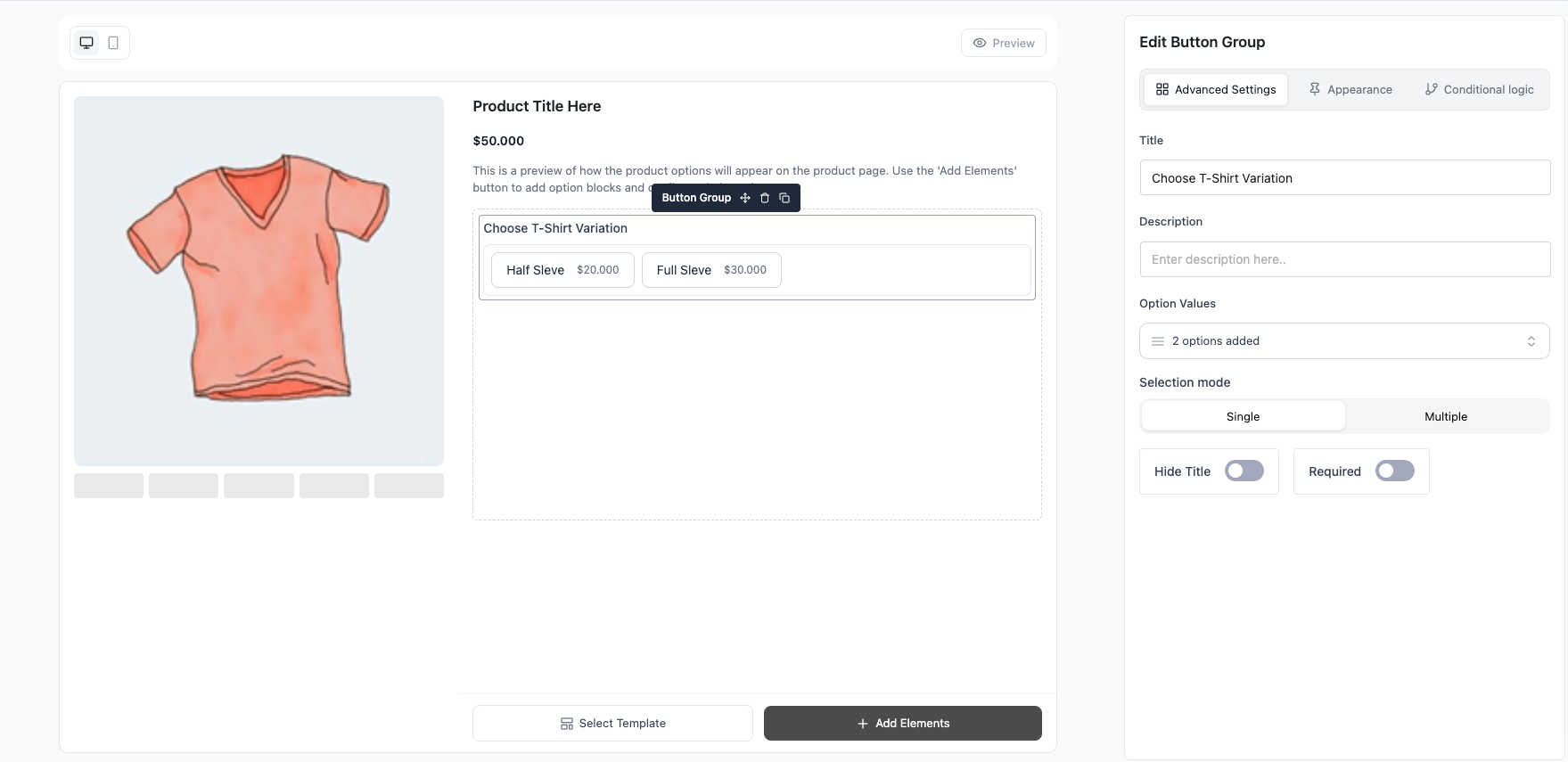
The Button Group field renders options as compact, tappable buttons. It supports Single mode (pick one, like radio) or Multiple mode (pick several, like checkboxes), and each choice adds to or subtracts from the price. Great for touch-friendly layouts.
Use Cases #
- “T-Shirt Size: S / M / L / XL (+$2)” — Tappable size buttons, one pick (Single mode).
- “Plan: Basic / Pro (+$10) / Enterprise (+$25)” — Clean tier selector that reads better than a list.
- “Add Toppings: Cheese (+$1) / Bacon (+$2) / Avocado (+$2)” — Pick several pills at once (Multiple mode).
- “Choose Colors: Red / Blue / Black” — Compact equal-priced buttons.
How to Use #
- Open Optiontics → Add-ons and edit (or create) an add-on form.
- Drag the Button Group block onto the canvas.
- Select the block to open its settings on the right.
- Add your choices — for each one set:
- Label — text on the button.
- Price — amount added when selected (negative to subtract).
- Price type — Fixed or Percentage of the base price.
- Default — mark a button as pre-selected.
- Set the selection mode and common settings (below).
- Save, assign to a product, and preview.
Settings & Customizations #
- Selection — Single (one pick, radio behavior) or Multiple (many picks, checkbox behavior).
- Title / Hide title / Description.
- Required — must select before add to cart.
- Show sale price — show the discounted choice price when set.
FAQ #
Q1: How do I let customers pick several buttons?
A1: Set Selection to Multiple.
Q2: Difference from Radio/Checkbox?
A2: Same behavior, button styling — Single mode = radio, Multiple mode = checkbox.
Q3: Can a button lower the price?
A3: Yes — enter a negative amount.
Q4: Can I pre-select more than one?
A4: Yes, in Multiple mode mark several choices as default.
Conclusion #
Reach for Button Group when you want compact, tappable options. Flip between Single and Multiple to cover both “pick one” and “pick many” cases with the same clean button layout.


