Why Your WooCommerce Product Page Isn’t Converting


Table of Contents
Your WooCommerce product page isn’t converting most often because of weak trust signals, slow page speed,confusing pricing, poor mobile experience, or a lack of product options that match what customers actually want.
For these reasons, visitors are landing on your page to buy but hesitate and leave because something on the page makes the buying feel uncertain or difficult.
The good news is that each of these reasons are easily diagnosable and fixable. This guide breaks down what’s likely going wrong, how to confirm the issue and what to do about it.
- A good WooCommerce conversion rate typically falls between 1.5-3%, depending on industry and price point.
- Weak images, no social proof, slow speed, and confusing pricing are the top reasons pages don’t convert.
- Diagnose issues using analytics funnels, session recordings, mobile audits, and customer surveys.
- Test one change at a time to know which fix actually improved conversion.
- Optiontics lets store owners add custom product options (engraving, gift wrap, add-ons) without code.
What is a Good WooCommerce Product Page Conversion Rate?
A good WooCommerce product page conversion rate typically falls between 1.5-3%. However, this rate varies depending on industry, price point and traffic source.
If your products fall under the premium category, it tends to convert lower. However, if your category is impulse-buy it will convert higher. So, what really matters more than hitting a benchmark number is tracing your own rate consistently and noticing when it drops.
Here’s a simple way to calculate the conversion rate of your WooCommerce product page:
Conversion rate= (Total purchases/Total visitors)*100
So, if 1000 people visit your product page and 20 of them buy, your conversion rate is 2%. For most categories, that’s a solid conversion rate.
But raw conversion rate only tells half a story. For instance, a 1.5% with a $120 average order can outperform a store converting at 3% with a $40 average order.
So, if you’re trying to improve WooCommerce conversion rate, track revenue per visitor alongside the percentage, not just the percentage on its own.
If your number sits well below the range above, something on the page is getting in the way. The next section breaks down exactly what that’s usually likely to be.
8 Reasons for Low-Converting WooCommerce Product Page
Whenever a visitor lands on your page, they’re there with the intention to buy. But obstacles like slow loading, weak images, or a clunky mobile layout push them right back out.
Here are the most common reasons your WooCommerce product page isn’t converting.
Weak or Low-Quality Product Image
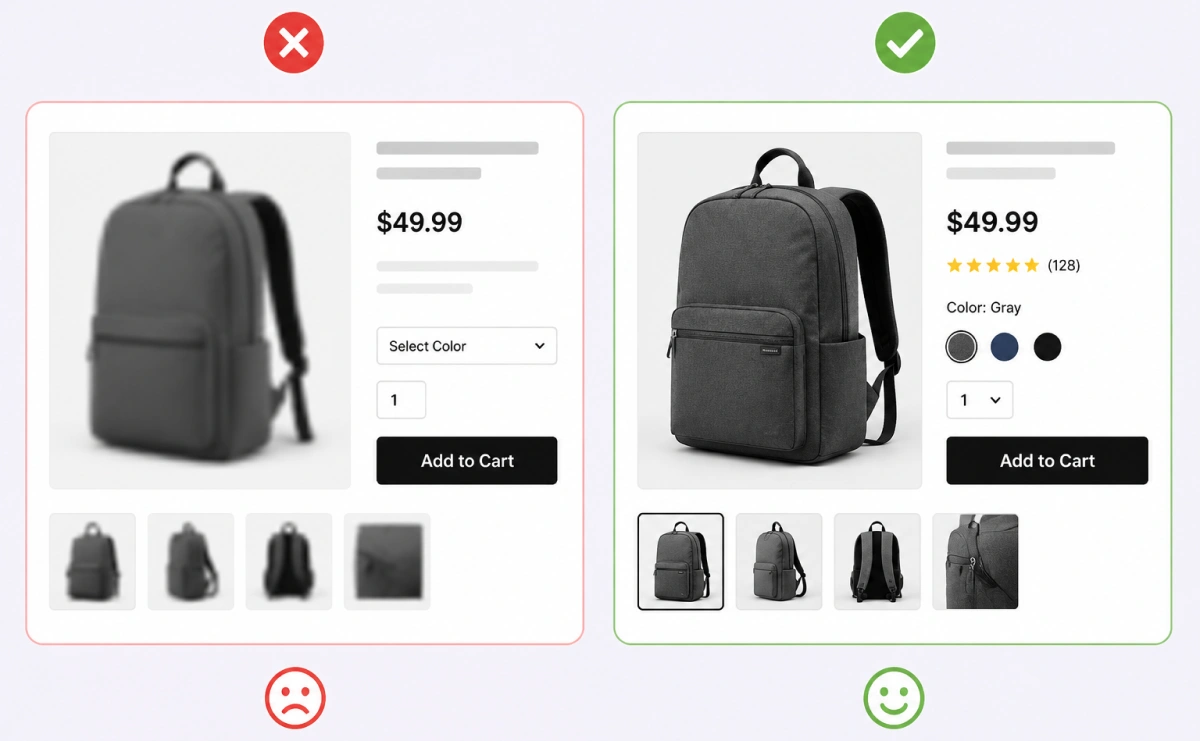
Images are the only way customers can judge your product since they can’t touch it or try it on. When the photos don’t deliver, visitors leave without buying.
Here’s where most product photos fall short:
- Low resolution makes the store look unfinished, even when the product itself is solid.
- A single flat product shot can’t show texture, scale, or fine detail the way multiple angles can.
- Missing lifestyle shots leave visitors unable to picture the product in actual use.
Good WooCommerce product page design starts with images that do the selling for you not just illustrate the listing.
No Social Proof (Reviews, Ratings, Q&A)
People trust other buyers more than they trust your product description. Without visible proof someone else was satisfied, hesitation wins.
This is what’s usually missing:
- No review count or star rating near the top means visitors have to dig for reassurance, and most won’t bother.
- A missing Q&A section leaves common pre-purchase doubts (sizing, compatibility, durability) unanswered.
- Even a small number of reviews placed early on the page can shift a visitor from hesitant to confident.
Slow Page Load Speed and Poor Mobile Experience
Most WooCommerce traffic comes from phones, so a page that’s slow or poorly optimized for mobile loses sales before it even loads fully. Speed and layout aren’t separate issues; they compound each other.
A few things usually cause this:
- Heavy image files and unoptimized scripts add seconds that visitors won’t wait through.
- Small text and cramped buttons make it hard to act, even if the page did load.
- A layout that isn’t single-column on mobile forces awkward pinching and scrolling instead of a smooth tap-to-buy path.
Note: Follow this article to learn more about how to rank your WooCommerce site at #1.
Customers Can’t Get the Exact Product They Want
When customers can’t get the exact version of a product they want, they leave rather than settle. This gap is often invisible because store owners rarely get direct complaints about it.
Here’s how this plays out in practice:
- A fixed “Add to Cart” button with no options blocks requests like engraving, color choice, or add-ons.
- Store owners often assume silence means no demand, when it usually means customers just left instead of asking.
- Plugins like Optiontics can add these options without needing custom code, closing the gap quickly.
You can fix this by manually adding custom fields through code, but you can also use a plugin like Optiontics to add these options without touching any code.
If you’re not sure whether your store needs product variations or product options, that distinction matters more than it seems.
Confusing or Untrustworthy Pricing
Visitors hesitate the moment pricing feels unclear or unpredictable. Doubt introduced this late in the journey is hard to undo before checkout.
Common culprits behind this doubt:
- Shipping costs that only appear at the final checkout step feel like a bait-and-switch, even when unintentional.
- Prices that shift between the product page and cart make visitors question the store’s reliability.
- A visible, full price breakdown upfront (product, shipping, taxes) removes the guesswork that causes drop-off.
No Urgency or Scarcity Signals
Most visitors don’t buy on the first visit, and without a real reason to act now, they simply leave the tab and forget. What friction remains after that only makes returning less likely.
Here’s what tends to get in the way:
- Fake countdown timers or “low stock” labels that never run out get noticed and damage trust faster than they create urgency.
- Too many required fields before checkout even starts adds friction the visitor didn’t expect this early.
- A cluttered layout that buries the buy button costs conversions that a real scarcity signal could have otherwise recovered.
Friction Before Checkout Even Starts
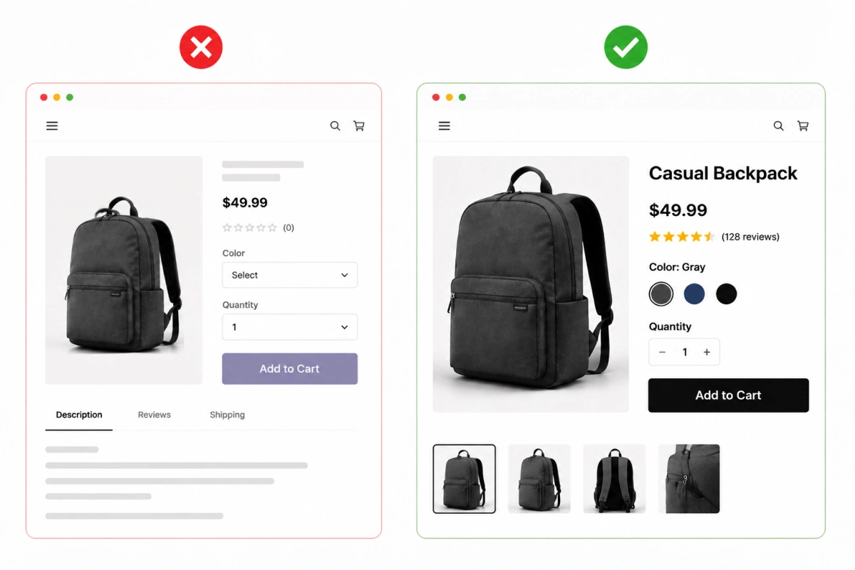
Conversion problems don’t always start at checkout. Sometimes they begin right on the product page, before the customer even clicks “Add to Cart.”
Here’s where that friction usually shows up:
- Too many required fields before checkout even starts adds unexpected effort right when the visitor was ready to buy.
- A cluttered layout that buries the buy button forces visitors to search for the one action they came to take.
- These issues seem minor on their own, but removing them is often enough to reduce cart abandonment in WooCommerce stores.
How to Find Out What’s Really Hurting Your Page?
Now that you know what the problem is, let’s get a step-by-step guide on how to identify the right problem hurting your page.
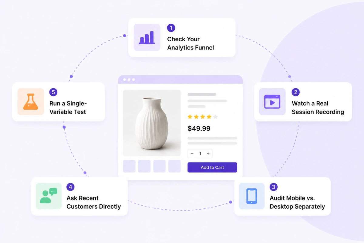
Step 1: Check Your Analytics Funnel
First, open Google Analytics or your store’s built-in reporting and look at where visitors drop off. Check whether people are reaching the product page but not adding to cart. Or are they adding to cart but abandoning before checkout.
Analyze the pattern because each pattern points to a different problem. If your visitors aren’t even clicking ‘Add to Cart’, the issue is likely on the product page itself like images, pricing or missing options.
However, if they’re abandoning the product page after adding to cart, the problem usually shifts toward checkout friction or unexpected costs.
Step 2: Watch a Real Session Recording
If you watch real session recordings, you’ll know why your conversion rate is lower. Numbers will only tell you what happened. But tools that record real visitor sessions let you watch someone scroll, hesitate, and leave. This will lead you to find out a problem you’d never catch by just looking at metrics.
Look for visitors who scroll past your reviews without stopping, hover over a pricing area repeatedly, or open and close the same product option more than once. These small hesitations are clues.
Step 3: Audit Mobile vs. Desktop Separately
Review your product page on your own phone, not just only on the desktop. Open it on your own phone and try to buy something the way a real customer would.
Then, pay attention to how long it takes to load, whether buttons are easy to tap, and whether anything feels cramped or hard to read.
If your conversion rate is noticeably lower on mobile than desktop, you’ve already found a major part of the problem.
Step 4: Ask Recent Customers Directly
Sometimes the fastest way to find a problem is to ask someone who almost didn’t buy it. A short post-purchase survey, or even a quick email to a handful of recent customers, can surface friction points you’d never catch from data alone.
Ask one simple question: “Was there anything that almost stopped you from buying?” The answers are usually more specific than anything an analytics dashboard will show you.
Step 5: Run a Single-Variable Test
Once you have a theory, test it. Change one thing at a time, like adding reviews, simplifying pricing display, or adding a product option, and compare conversion rate over a set period before and after.
Resist the urge to change five things at once. If you do, you won’t know which change actually moved the number.
How to Fix the Problems and Improve Your WooCommerce Conversion Rate
Here’s a quick sneak peek at the problems, their fixes and what amount of effort and impact is required.
| Issue | Fix | Effort | Impact |
|---|---|---|---|
| Weak product images | Add zoom, multiple angles, lifestyle shots | Low | High |
| No social proof | Enable reviews and a Q&A section | Low | High |
| Slow page speed | Compress images, reduce unnecessary plugins | Medium | High |
| Poor mobile experience | Test and fix mobile layout, tap targets | Medium | High |
| No flexible product options | Add custom fields, add-ons, personalization | Medium | High |
| Confusing pricing | Show full price breakdown upfront | Low | Medium |
| No urgency signals | Add genuine stock or time-based offers | Low | Medium |
| Checkout friction | Simplify required fields, clarify next step | Medium | Medium |
Why Product Personalization Quietly Fixes More Than You’d Expect
If a customer wants a gift message, custom engraving, or a chosen delivery date and your page only offers “Add to Cart,” they leave instead of asking. This issue rarely shows up as a conversion problem. It looks like a missing feature instead.
This is where a plugin like Optiontics comes in handy and solves this directly. It lets you add custom fields, dropdowns, checkboxes, file uploads, and conditional logic to your WooCommerce product pages without code. Common options store owners add:
- Gift wrap or a personal note
- Custom engraving or text
- File uploads for print or design orders
- Add-on services or upgrades
- A specific delivery date
This does two things. It removes a friction point you can’t see in analytics, since customers who wanted more options simply leave instead of asking. It also raises WooCommerce average order value, since a customer adding gift wrap or a premium upgrade spends more without any extra convincing.
Optiontics also has an AI option builder. So, you can describe what you sell, and it generates the relevant fields and pricing rules for you.
Take a look at Optiontics’ full feature list or check the pricing plans to see which setup fits your store.
Pro Tips for WooCommerce Conversion Optimization
Here are a few extra habits worth building into your store, beyond the fixes:
- Genuine scarcity works, fake scarcity backfires. A real low-stock count or time-bound offer nudges hesitant buyers. A countdown timer that resets every week just trains people to ignore it.
- Put trust signals where they’re seen first. Reviews, ratings, and any guarantees should sit near the top of the page, not buried below a long description.
- Keep extra options quick to fill out. If you add custom fields or add-ons, don’t turn checkout into a form. Two or three quick choices convert. Ten required fields don’t.
- Show the full price before checkout, not during it. Any cost that appears unexpectedly late in the process, shipping, fees, or taxes, is one of the fastest ways to lose a sale you’d already won.
Final Thoughts
A low-converting WooCommerce product page isn’t bad luck. It’s a specific, fixable problem. Start with the quick wins: better images, visible reviews, clear pricing. Then tackle the bigger ones, like mobile speed and giving customers the options they’re already looking for.
If that last part sounds familiar, Optiontics makes it easy to add those options without writing any code. Your traffic isn’t the problem. Your product page just needs to make buying easier.
Start Using Optiontics Today
Ready to take your events to new heights? Get Optiontics now and enjoy a seamless event management experience.
FAQs
How long does it take to see results after fixing conversion issues?
Usually 2 to 4 weeks for smaller fixes. Bigger changes take a bit longer to show a clear pattern.
Does free shipping actually improve conversion rates?
Yes. Surprise shipping costs are a top reason for cart abandonment. Showing costs upfront will reduce cart abandonment issues.
Should I run A/B tests before making permanent changes?
If you have enough traffic, yes. If not, a simple before-and-after comparison works fine.
Does adding a product video help conversions?
Often, yes. It answers questions images alone can’t, especially for harder-to-explain products.
Is it normal for conversion rates to fluctuate week to week?
Yes. Traffic source and seasonality both affect it. Look at trends, not single days.
Does live chat improve product page conversions?
It can, especially for pricier or complex products. A clear FAQ section often covers the same ground.