A Complete Website Heatmap Guide: How to Setup, Configure and Track User Behavior with Microsoft Clarity

Table of Contents
Did you ever think about what your website visitors are doing on your WordPress site?
- Where are they clicking?
- How far are they scrolling?
- Which parts are getting ignored?
If not, then you are missing out on a vital thing. And that’s where the role of website heatmaps and behavioral analytics tools comes in.
A heatmap is a powerful visual tool that shows you exactly how users interact with your site. It allows you to optimize layouts, enhance user experience (UX), and boost conversions based on real behavior, rather than guesswork.
In this detailed guide, you’ll learn:
- What heatmaps are and how they work
- Why they’re crucial for WordPress site owners
- The best heatmap tools (with comparisons)
- How to set up Microsoft Clarity on your site (step-by-step)
- How to analyze heatmap data to make smart, data-driven changes
Let’s dive in and unlock the full potential of user behavior analytics on your site!

Manage Events Like a Pro
Try the easiest way to create, manage, and promote events with Eventin.
- 🟣 AI event generation
- 🟣 Ticket & Certificate builder
- 🟣 Secure ticket sales
- 🟣 Event analytics & report
What is a website heatmap?
A website heatmap is a visual tool that shows how users interact with your website by using colour-coded overlays. These maps highlight areas of high engagement (like clicks or scrolls) in warm colors (red, orange) and low-engagement zones in cooler colors (blue, green).
In simple terms, a heatmap helps you track user behavior for UX optimization. Additionally, it reveals where visitors click, how far they scroll, what they overlook, and what captures their attention.
How does a heatmap work on a website?
Heatmaps collect and analyze real user interaction data through JavaScript tracking code added to your site. When you log in to the heatmap tool, you need to add your site using a JavaScript tracking code and then connect it.

After some time, you will receive the tracking updates. However, you will need to wait for a while so that the tool can retrieve the data from the user’s behavior. Then, it generates visual reports based on user actions.
Here are some data that a website heatmap show:
- Click heatmaps: Show where users are clicking most (buttons, links, images)
- Scroll heatmaps: Show how far down the page users are scrolling
- Move/Mouse tracking heatmaps: Show where users move or hover their mouse
- Bonus, unused, or cold areas: Cold zones (marked in blue or gray) indicate areas that are being ignored. This helps you clean up unnecessary distractions or reposition underperforming elements.
These data become crucial for a website owner to make important decisions. For example, changing any section on the landing page, adding a tweak in the CTA button, or upgrading the structure.
Suppose,
🔍 If your “Buy Now” button is receiving barely any clicks, a heatmap can reveal whether users are even seeing it, or getting distracted by something else higher up on the page.
Therefore, a website heatmap is one of the most useful tools among the best WordPress plugins for understanding how visitors behave on your site.
Why should you implement a heatmap on your WordPress site?
The answer is simple: heatmaps allow you to improve your website’s performance based on real-time behavior data, not assumptions. This drastically reduces guesswork and helps align your content and layout with what users expect.
Suppose you saw that users are focusing on the feature page of your main landing page. You can assume that users are reading your feature section and want to know more about the service or brand.
And that’s where you can tweak, edit your copies, add links, or a pop-up section for that portion.

Apart from knowing what’s working, what’s not, and what needs fixing, a heatmap helps you understand these metrics through user behavior analysis and is a powerful toolkit in your conversion rate optimization.
For example,
- It helps you identify where users drop off so you can improve content structure and reduce bounce rates (an indirect SEO factor).
- You’ll understand what content users value most and what they ignore.
- A single tweak, such as moving a CTA button based on heatmap data, can dramatically increase sign-ups or sales.
Now you may be curious to know which website heatmap tools I should use.
Just before going to learn about the top heatmap tools, here’s a guide on how to increase event revenue using data-driven insights to improve your event sales and small UX changes can make a big impact.
Let’s figure it out:
What are the best heatmap tools for WordPress? [ A quick comparison]
There are several great heatmap tools available for WordPress. Each one has its features, strengths, and pricing. To help you choose the right one, here’s a quick comparison of the most popular heatmap tools you can start using today.

What our expert recommend?
Yes, you have guessed it right. We recommend 🥳Microsoft Clarity for tracking your website users’ behavior. It’s easy to use, install, free and a hassle free tool.
What’s more? Yes there are still so many things in one place:
- Unlimited heatmaps and session recordings
- No site traffic limits
- Easy integration with WordPress (manual or plugin method)
- GDPR and CCPA compliant
- And so on
Additionally, Clarity offers filtering options by device, browser, country, and more. Overall, it makes the entire user behavior analysis easy, simple, and in-depth for both general use and geo-specific insights.
If you need more advanced features, such as A/B testing or built-in surveys, Hotjar or Crazy Egg may be better options. However, most WordPress users will find everything they need in Microsoft Clarity.
What are the considerations before implementing a heatmap on a website?
If you have already implemented the heatmap on your website, then you know what to do. However, for a first-time user, please ensure your website is ready for the heatmap implementation.
For instance, you can check the heatmap on a staging site to check how the options are working or not. It’s not wise to directly use the heatmap on a live site to prevent any technical issues.
A staging site is a private clone of your live website where you can safely test changes before making them public.
What can you do on a staging site?
- Test plugin or theme updates
- Try new features or layouts
- Fix bugs or design issues
- Ensure compatibility with WordPress core updates
- Review changes with your team or client before going live
Your hosting provider will provide you with the option to create a staging website. Move to the staging site portion and make that. It’s simple!

Additionally, be sure to take a backup of your website before making any significant changes to your live site.
How to set up Microsoft Clarity on your WordPress site
First off, you need to create an account for Microsoft Clarity to connect your WordPress site. It’s quick and straightforward, and 100% free to do that.
You don’t need any additional skills, and you’ll start seeing click maps, scroll tracking, and session recordings within minutes.
Here’s how to do it:
Step 1: Get started and log in to Microsoft Clarity
- Go to clarity.microsoft.com
- Click “Get Started” and sign up with your Microsoft, Google, or Facebook account.
- Once you’re logged in, click “Add a new project.”
- Enter your website name and URL, then choose the platform as “Other.”
If you want to automate your workflow after analyzing heatmap data, you can also learn how to integrate Zapier in your WordPress website.
Step 2: Microsoft Clarity connection methods
The next stage will ask you about installation methods.
- Install and connect through the third-party platforms
- Manual installation
- Or install using NPM.

Since we are looking to connect through our WordPress site, we will opt for the third-party option and integrate the tool using a plugin.
Step 3: WordPress site configuration (It’s easy)
From your WordPress dashboard, go to Plugins → Add New, then search for Microsoft Clarity. Click on the install and then activate the plugin.

After that, it will simply ask you to sign in.
Step 4: Add a project
In the next step, you need to add the project. You can see the previously saved project in the drop-down list. Or you can start with a new one. If you have a previous project, choose from the list. Otherwise, start with a new one.

Give a project name, URL, and determine the industry.

Step 5: Welcome to the Microsoft Clarity dashboard
After successfully connecting your WordPress site with Microsoft Clarity, you can see the dashboard showing the user’s data.

💡 Side note: These are the dummy data generated by Microsoft itself. For a live site, the data may vary.
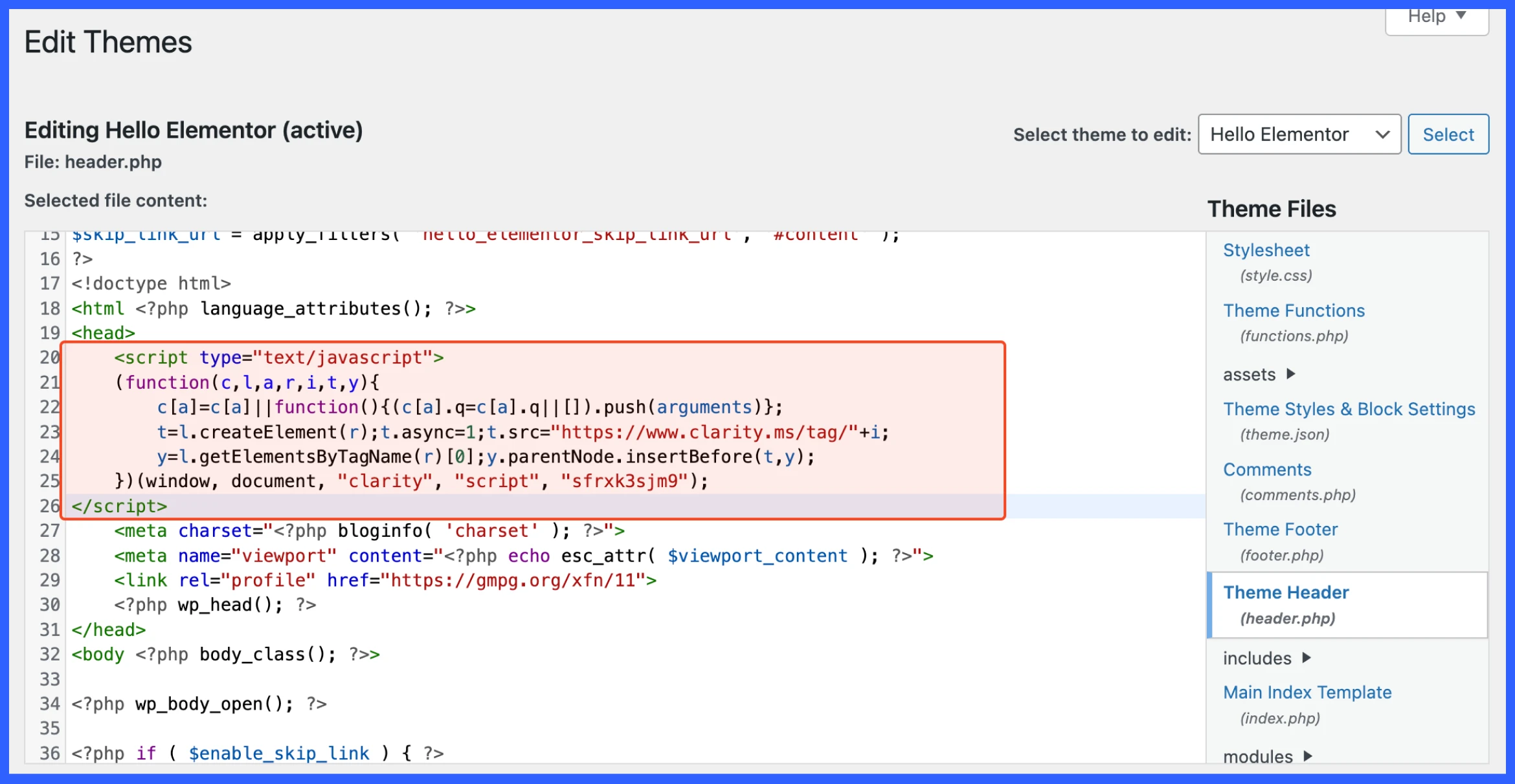
Additional step: Manually add tracking code
To connect your website to Microsoft Clarity directly, you can use the tracking code. Just copy the code and paste it into the <head> element of your website.
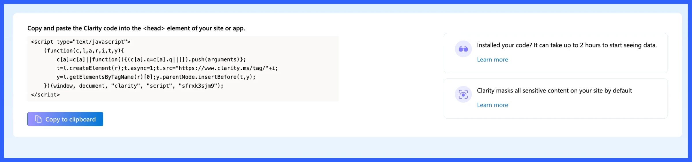
Navigate to your WordPress backend and editor options. And then paste the code here. After connecting, you will see this message on the Microsoft Clarity dashboard.
📘 Quick guide: Sometimes when you first connect Clarity to your website, you might not see any data right away. Don’t worry this is normal.
Learn why data might be delayed in your Clarity dashboard →
Microsoft Clarity dashboard explained (live overview)
The Microsoft Clarity dashboard gives you a real-time snapshot of how users interact with your website. Here’s a quick breakdown of what each section shows:
Key metrics at the top:
- Sessions: Total user visits (bot traffic excluded)
- Pages per session: How many pages each user views on average
- Scroll depth: How far users typically scroll down the page
- Active time spent: How long users actually engage (not just time on page)
Users overview:
- Live users: How many users are on your site right now
- Unique users: Total number of individual users
- Breakdown of:
- New vs. returning users
- Top users by session count and location
Insights panel:
- Rage clicks: Users clicking repeatedly in frustration
- Dead clicks: Clicks on elements that don’t do anything
- Excessive scrolling: If users scroll too far without finding what they want
- Quick backs: Users bouncing back quickly after landing

More insights about dashboard
This section of the Clarity dashboard provides deeper insights into how your site performs across various browsers and how quickly it loads for users.
Browsers
The panel shows which web browsers your visitors are using:
- Chrome dominates (72.67% of sessions), followed by Edge, Chrome Mobile, and Safari.
- This helps you test and optimize your site based on what your audience uses.
- Each browser icon includes shortcuts to session recordings and heatmaps for specific sessions.
Performance
The performance tab shows your Core Web Vitals and overall speed performance critical metrics that directly impact site usability optimization and SEO.
- Performance Score: 74/100, a blend of speed, stability, and responsiveness metrics
- LCP (Largest Contentful Paint): 5.1s → Too slow (poor)
- INP (Interaction to Next Paint): 180ms → Good responsiveness
- CLS (Cumulative Layout Shift): 0.13 → Needs improvement
Top pages
The final panel shows your most visited pages, in this case, the homepage (clarity.microsoft.com) with 2,206 sessions.
- You can use this data to prioritize heatmap analysis and A/B testing on high-traffic pages.
- Session replays and heatmaps are accessible with just one click.

Together, these insights enable you to optimize your WordPress site for the most widely used browsers, ensuring a smooth and fast experience for your users.
For example, a smart food ordering and reservation plugin could use heatmap data to identify which menu items get the most attention.
How to use heatmaps and measure results to improve website quality
Here is a quick guide for your review.
However, we will be showing the live demo, so you can get a sneak peek of how the heatmap really works.
- From your Clarity dashboard, click on the “Heatmaps” icon in the top menu bar (as shown in the screenshot). This will take you to the heatmap tool.
- Enter a URL or choose a page
- After selecting or entering a page, click “View heatmap”.

1. How to measure click data in Microsoft Clarity?
After clicking on the heatmap view for the page in Microsoft Clarity, it visually maps out where users are clicking the most, using colour-coded indicators.
The metrics of the heatmap
- Red areas = Most-clicked spots (high engagement)
- Blue areas = Less-clicked (low interaction)
- Grey/no color = No interaction
Left sidebar reports
- Shows a list of elements ranked by click volume
- Includes total clicks and percentage of clicks per element
- Example:
- ••••• received 364 clicks (16.01%)
- #googleSignIn > SPAN[1] got 319 clicks (14.03%)
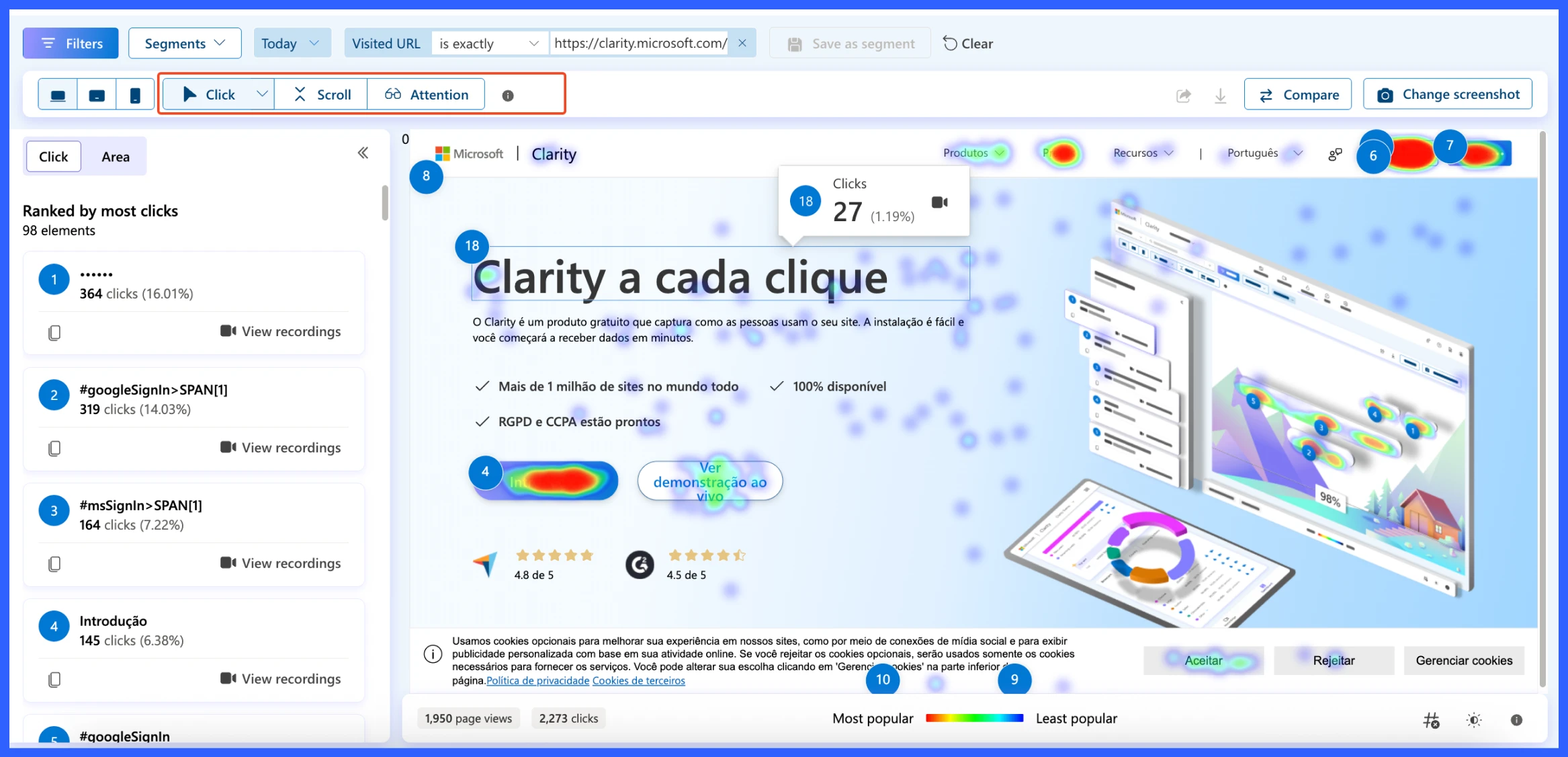
The results of this page is:
- 1,950 page views
- 2,273 total clicks on the page
This tells you how active users were on this particular page and helps assess whether the clicks align with your intended layout or CTAs.
Let’s say your goal is to drive clicks to a “Sign Up” button, but it’s only getting 5% of total clicks. Using this heatmap, you can:
- Move the button to a more visible area
- Change its color or wording
- A/B test different placements
🖱️ Explore click behavior: Want to see where users are really clicking on your site? Check out the detailed reports of Click Maps.
View Click Map reports in Microsoft Clarity →
2. How to measure scroll depth data in Microsoft Clarity?
The Scroll Heatmap shows how far visitors scroll, helping you identify which content areas get visibility and where drop-offs occur. It’s essential for content layout optimization, especially if key CTAs or forms are placed lower on the page.
What you’re seeing
- Red areas (top of the page) = Most viewed (100% of users)
- Cooler tones = Fewer visitors reached that section
- The darker the section, the lower the scroll engagement
If you’re running an event site, combine heatmaps with your best event promotion strategy to understand which campaigns attract more signups.
Scroll data
- % Scrolled: The vertical point on the page
- # of visitors: How many users reached that scroll depth
- % Drop-off: How many visitors left before reaching this point
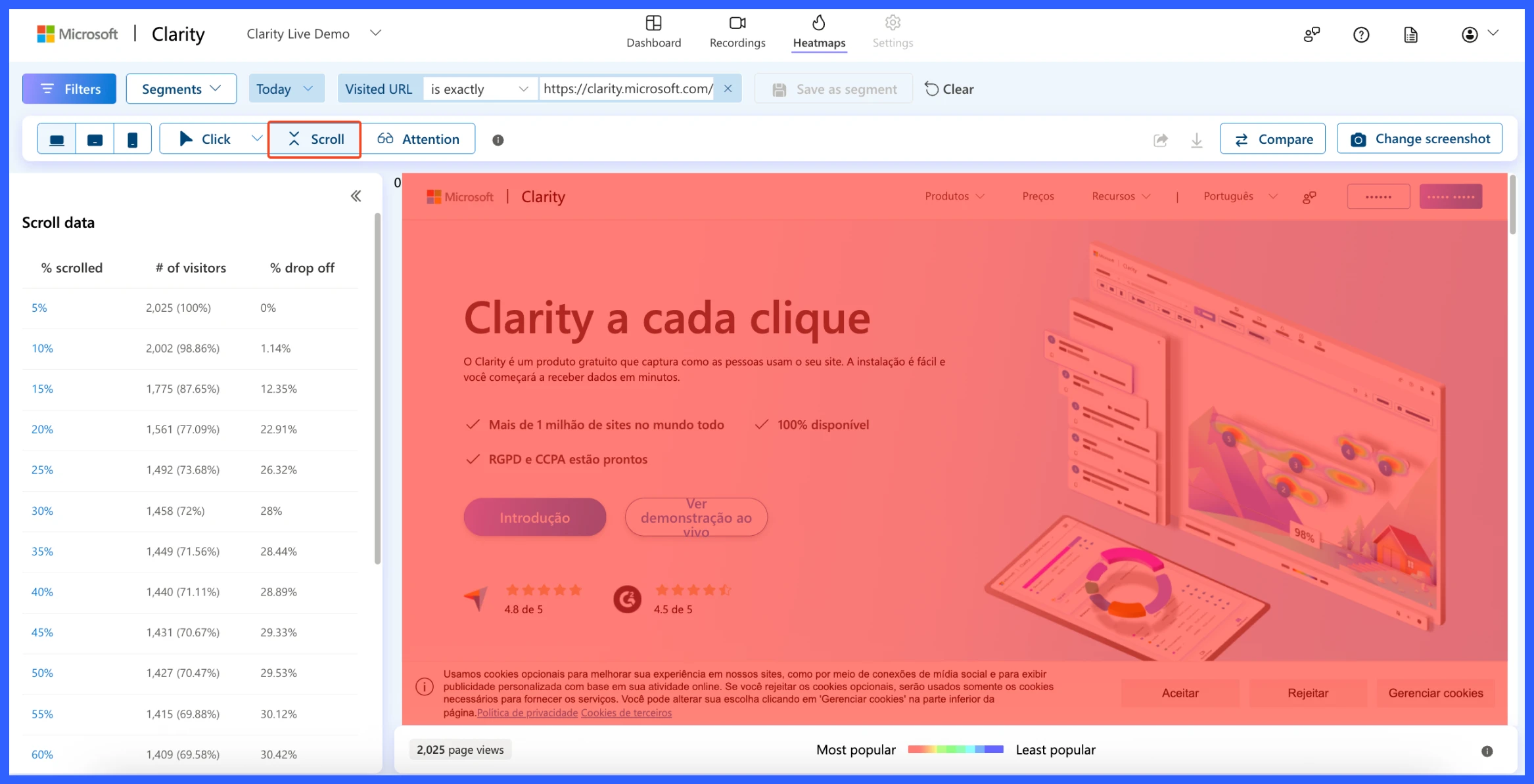
The result of the scroll:
- 100% of visitors saw the top 5% of the page
- Only 69.58% reached the 60% mark
- Sharp drop-off starts around 20–30%, where 28% of users leave
Let’s say your signup form is placed at the bottom of the page. The scroll heatmap reveals that only 30% of visitors ever get there, meaning 70% never even see it.
What could be the Solution?
- Move the form higher up
- Break long pages into shorter ones
- Add sticky or inline CTAs earlier in the content
📊 Understand how far users scroll: Want to know which sections of your page users actually see? Check out the detailed report on Scroll Maps.
View Scroll Map reports in Microsoft Clarity →
3. How to measure website user attention data in Microsoft Clarity?
The Attention Heatmap displays the amount of time users spend on various parts of your page. Instead of just clicks or scroll depth, this view focuses on user engagement per section.
This is extremely useful for understanding which parts of your content are being read and which are being ignored.
What you’re seeing
- Bright colors (light blue/green) = Sections where users spend more time (high attention)
- Darker/red areas = Sections with less time spent (low attention)
- On the right, there’s a color bar scale showing attention intensity from top to bottom
Left panel: attention data
This panel shows:
- % scrolled: Which vertical section of the page are you analyzing?
- Avg time spent: How long users stayed in that section
- % of session length: How much of their total time was spent there

Insights from the data:
- Users spent ~6 minutes between the 5–10% scroll range (most attention)
- Sharp drop-off starts after 25% scroll, where time spent decreases drastically
- The bottom half of the page receives less than 1% of session time
What you can do with this
- Move important content (like CTAs or lead forms) into high-attention zones
- Improve low-attention areas with more engaging copy, visuals, or formatting
- Combine this with scroll + click data for a complete behavioral picture
🗺️ See which areas get the most interaction: Area Maps give you an overview of which parts of your page attract the most attention.
View Area Map reports in Microsoft Clarity →
So, these three crucial data points are the most important for your website and users.
The key takeaways are:
- If the users are clicking most on buttons and top navigation links. You CTAs should be placed early and clearly.
- If the scroll data shows that over 70% of visitors drop off before reaching the halfway mark, it’s critical to keep your most important content above the fold.
- Attention heatmaps reveal that users spend the most time on the upper 10–20% of the page, confirming that this is where engagement is highest.
Together, this insight helps you prioritize content placement, streamline your design, and boost conversions by focusing on where users engage, not where you think they do.
Bonus: Geo-specific use cases (optional SEO layer)
While most website owners focus on overall user behavior, understanding where your visitors come from geographically can give you a significant advantage, especially if you’re targeting users from different regions, countries, or cities.
Microsoft Clarity provides geo-filtering options, allowing you to segment heatmap data by location. This means you can see how users in the US, UK, Canada, India, or any region interact with your site differently.
This location-based insight can uncover hidden trends and help you personalize your content, layout, and CTAs based on regional behavior, giving you an edge in both user experience and geo-targeted SEO.
How to check geo-specific user behavior with Microsoft Clarity?
To check the geo-specific user behavior in Microsoft Clarity, click on the filter and set the country name. You can either select a specific country or choose multiple. Hit apply once you are done.

That’s all, you will get the same interface for the website heatmap report. Now, review the data, take notes, and plan your next strategy for improvement.

You can conduct various A/B tests for your website, tailored to your specific needs and requirements, including traffic source, user path, journey, performance, sessions, pages, and more.
🧠 Make smarter decisions with comparisons: You can also check and compare heatmaps to better understand user behavior across different pages, devices, or time periods.
Explore the Heatmap Comparison feature in Microsoft Clarity →
Have any confusion? Here are some FAQs regarding website heatmaps
-
What is Microsoft Clarity, and is it available for unrestricted use?
Microsoft Clarity is a free behavioral analytics tool that provides click maps, scroll maps, session recordings, and more, without any traffic limits or subscription fees.
-
How does Microsoft Clarity collect heatmap data?
Clarity utilizes a lightweight JavaScript snippet to collect clicks, scrolls, mouse movements, and session data, all while maintaining user privacy and optimal performance.
-
Is Clarity compliant with GDPR and CCPA regulations?
Yes. Clarity is GDPR- and CCPA-compliant, enabling the masking of sensitive information and facilitating first-party cookie handling.
-
How long does it take to generate heatmaps after setting up Clarity?
Once installed, Clarity heatmaps are fully functional within 30 minutes, and session recordings appear within hours.
-
Why am I seeing low click data or missing heatmaps?
This may occur if the tracking code isn’t installed correctly, filters are misapplied, or insufficient traffic has occurred. Double-check installation, clear filters, and verify targeting the correct URL
-
Do heatmaps slow down my WordPress website?
No, Clarity’s tracking script runs asynchronously, meaning it has no perceptible impact on site load speed or performance.
Ready to optimize? Start using heatmaps today!
Heatmaps provide a behind-the-scenes view of how visitors interact with your website. Instead of guessing what works, you can see what gets attention, what gets ignored, and what needs fixing, all visually.
Whether it’s a low-performing CTA button, a buried sign-up form, or an overlooked product section, heatmaps help you identify the friction points and fix them quickly.
And the best part? Tools like Microsoft Clarity make it incredibly easy (and free) to get started, even if you’re a complete beginner.
So go ahead, install a heatmap tool on your WordPress site, explore user behaviour, and start making smarter changes that drive results.
🔍 Looking for a More Powerful Event Plugin?
Eventin is a feature-rich, user-friendly event management plugin trusted by thousands of WordPress users. From single-day meetups to multivendor marketplaces, Eventin helps you do it all with ease.
🔽 Download Eventin Free from WordPress.org👉 Have questions or need help setting it up? Please drop a comment or reach out, we’re here to help!